ShopDreamUp AI ArtDreamUp


Suggested Deviants


Suggested Collections


You Might Like…


Description
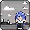
Blue from The Revolution [link]
Trying out a new style, making eyes bigger, noses less craptastic and hair more hair like. I think it works. now lets see if i can be consistent.
I fail at coloring. practice practice.
Blue and The Revolution belongs to Me, and the people who inspired the story
Trying out a new style, making eyes bigger, noses less craptastic and hair more hair like. I think it works. now lets see if i can be consistent.
I fail at coloring. practice practice.
Blue and The Revolution belongs to Me,
and the people who inspired the story Image size
700x1185px 334.31 KB
© 2009 - 2024 Blue6
Comments16
Join the community to add your comment. Already a deviant? Log In
Hmmm ... LOL
First thing I notices, is one boob is bigger than the other! XD Plus the boobs are so high up ... and the arms are like tubes. Arms have muscles you know! Try looking up and doing some research or something LOL! The angle of the eyes and the eyebrows and the shortness of the neck makes it look like you're trying to have the girl be looking up at us, but the nose is angled almost like we'd be looking at it from a little below and ... maybe from the side XD and the shape doesn't work right! The "ball" bit (the part at the end LOL) should be more on level with the nostrils lawl") Another thing I noticed is the collar bone doesn't line up with the shoulders! Feel along you're collar bone and you'll see what I mean!!
Another thing I noticed is the collar bone doesn't line up with the shoulders! Feel along you're collar bone and you'll see what I mean!!
The neck looks a lil short, and I think you were trying to have her be bowing her head, but because of the angle of the shoulders and the rest of the body she looks like she's just got her head right dab on her shoulders LOL. Plus the shape of the body is off -- her ribs are too elongated and they aren't shaped right -- check out a skeleton! You got the bending kind of outwards like ) at least on the back part, but they should bend more like this: (!! You've got a similar problem with the hips, the body just seems to slope into them when really there would be more tuck in the waist!
I love the backlighting you've got though! The lighting in general is very atmospheric! The only problem I see is the colouring very messy and scribbly -- a painting style works better if it's blended together a bit more, maybe with bigger brush strokes! The line art is very static, try giving the lines some weight and tapering the lines, and maybe try colouring them a little so they don't stick out so much! Leaving them like that makes the picture look flatter than it should!
Hope this helped LOL! Practice and you'll improve in no time XD
First thing I notices, is one boob is bigger than the other! XD Plus the boobs are so high up ... and the arms are like tubes. Arms have muscles you know! Try looking up and doing some research or something LOL! The angle of the eyes and the eyebrows and the shortness of the neck makes it look like you're trying to have the girl be looking up at us, but the nose is angled almost like we'd be looking at it from a little below and ... maybe from the side XD and the shape doesn't work right! The "ball" bit (the part at the end LOL) should be more on level with the nostrils lawl
The neck looks a lil short, and I think you were trying to have her be bowing her head, but because of the angle of the shoulders and the rest of the body she looks like she's just got her head right dab on her shoulders LOL. Plus the shape of the body is off -- her ribs are too elongated and they aren't shaped right -- check out a skeleton! You got the bending kind of outwards like ) at least on the back part, but they should bend more like this: (!! You've got a similar problem with the hips, the body just seems to slope into them when really there would be more tuck in the waist!
I love the backlighting you've got though! The lighting in general is very atmospheric! The only problem I see is the colouring very messy and scribbly -- a painting style works better if it's blended together a bit more, maybe with bigger brush strokes! The line art is very static, try giving the lines some weight and tapering the lines, and maybe try colouring them a little so they don't stick out so much! Leaving them like that makes the picture look flatter than it should!
Hope this helped LOL! Practice and you'll improve in no time XD